Spring Boot RESTful Product Web Services with React Integration

In this post, we build a modern React Frontend for Spring Boot Web Services, enabling seamless product search, display, and upload. Using Vite for setup, we integrate React with the backend and resolve CORS issues efficiently.
The guide includes creating reusable components like SearchBar, ProductList, and ProductCard, handling file uploads, validating forms, and managing state with React hooks (useState, useEffect). By the end, you’ll have a functional product catalog app demonstrating smooth interaction between React and Spring Boot.
Prerequisite: Ensure you have a working backend API. If not, check out our guide on Building a RESTful Product API with Spring Boot. This resource details the API creation process, including endpoints for product management.
Setting Up a React Frontend Project
Initialize the Project
Open your terminal and run the following command to create a new Vite-based React application:
npm create vite@latest product-react --template react
cd product-react
npm install
Installing Dependencies
To build our React application, we need specific libraries that provide essential functionalities:
- prop-types: This to validate the props of a React component.
- axios: This library will allow us to make HTTP requests, which is useful for fetching data from the Spring Boot REST API we had made.
- react-router-dom: We use react-router-dom to manage navigation and routing between different pages of the application.
- react-bootstrap: We use react-bootstrap to incorporate Bootstrap components into our React application easily.
- bootstrap: This is a CSS framework that provides styling just by using classes.
- react-hook-form: A library we’ll be using for handling form state and validation efficiently.
Now to Install the above mentioned dependencies, run the following command in the same project scope.
npm install axios react-router-dom react-bootstrap bootstrap react-hook-form prop-typesStructuring the Project
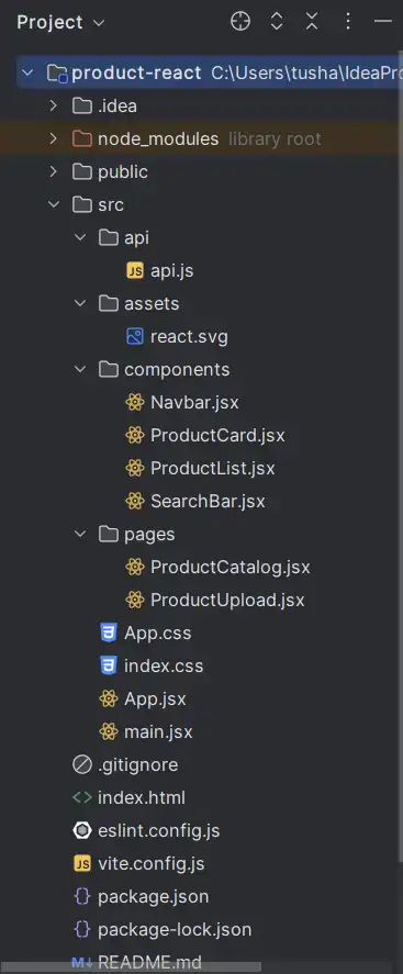
Organizing your project into a clear and logical structure is essential for maintainability and scalability. Below is an snapshot of the project structure we will follow:
Key Folders we will be working with:
src/api/: Houses all API-related logic, keeping your data-fetching functions organized.src/components/: Includes reusable UI components like theNavbar,ProductCard, andSearchBar.src/pages/: Contains the main application pages likeProductCatalogandProductUpload, where components come together to create functional views.
API Utilities for Fetching and Searching Products
To simplify API interactions, we’ve created a centralized file to handle all data-fetching logic related to products. The fetchProducts function retrieves the list of products from the backend, formatting image paths for direct usage in the UI. Similarly, the searchProducts function queries the API for products matching a search term and returns the results in a usable format.
import axios from "axios";

// Fetch products
export const fetchProducts = async () => {
    const response = await axios.get("/api/products");
    const products = response.data;

    return products.map(product => {
        const imagePaths = product.imagePaths.map(imagePath => `/api/images/${imagePath}`);
        return {...product, imagePaths};
    });
};

// Search products
export const searchProducts = async (query) => {
    const response = await axios.get(`/api/products/search?query=${query}`);
    const products = response.data;

    return products.map(product => {
        const imagePaths = product.imagePaths.map(imagePath => `/api/images/${imagePath}`);
        return {...product, imagePaths};
    });
};
Building Components
Navbar Component
A good navigation bar is essential for any web application, as it enables users to navigate through different sections effortlessly. In our application, we will have two main pages: one for product upload and another for product search.
Below is the Navbar component for our application:
import { Link, NavLink } from "react-router-dom";

const Navbar = () => {
    return (
        <>
            <nav
                className="navbar navbar-expand-lg"
                style={{
                    background: "linear-gradient(to right, #000000, #0056b3)",
                    color: "#fff",
                }}
            >
                <div className="container">
                    <Link
                        className="navbar-brand fw-bold fs-4"
                        to="/"
                        style={{
                            color: "#fff",
                            letterSpacing: "1px",
                        }}
                    >
                        MyMarketplace
                    </Link>
                    <button
                        className="navbar-toggler"
                        type="button"
                        data-bs-toggle="collapse"
                        data-bs-target="#navbarNav"
                        aria-controls="navbarNav"
                        aria-expanded="false"
                        aria-label="Toggle navigation"
                        style={{ borderColor: "#fff" }}
                    >
                        <span className="navbar-toggler-icon"></span>
                    </button>
                    <div className="collapse navbar-collapse" id="navbarNav">
                        <ul className="navbar-nav ms-auto">
                            <li className="nav-item">
                                <NavLink
                                    className="nav-link"
                                    to="/"
                                    style={({ isActive }) => ({
                                        color: isActive ? "#ffd700" : "#fff",
                                        fontWeight: isActive ? "bold" : "normal",
                                    })}
                                >
                                    Home
                                </NavLink>
                            </li>
                            <li className="nav-item">
                                <NavLink
                                    className="nav-link"
                                    to="/product-upload"
                                    style={({ isActive }) => ({
                                        color: isActive ? "#ffd700" : "#fff",
                                        fontWeight: isActive ? "bold" : "normal",
                                    })}
                                >
                                    Add Product
                                </NavLink>
                            </li>
                        </ul>
                    </div>
                </div>
            </nav>
        </>
    );
};

export default Navbar;
Product Card Component
The ProductCard component is a reusable UI element designed to display individual product details. It dynamically renders product information, including the name, description, price, stock availability, and images. To achieve this, we’ll pass product details as props, making the component adaptable and reusable across various datasets.
For products with multiple images, the component incorporates a Carousel from react-bootstrap, allowing users to easily browse through the available images.
import { useState } from 'react';
import { Carousel } from 'react-bootstrap';
import PropTypes from 'prop-types';

const ProductCard = ({ product }) => {
    const fallbackImage = 'https://via.placeholder.com/200?text=No+Image+Available';
    const [activeIndex, setActiveIndex] = useState(0);

    const handleMouseOut = () => {
        setActiveIndex(0); // Reset to first slide
    };

    return (
        <div className="col-md-4 mb-4">
            <div
                className="card h-100 shadow border-0 rounded-lg bg-light"
                style={{ transition: "transform 0.3s", cursor: "pointer"}}
                onMouseOver={(e) => (e.currentTarget.style.transform = "translateY(-10px)")}
                onMouseOut={(e) => {
                    e.currentTarget.style.transform = "translateY(0)";
                    handleMouseOut();
                }}
            >
                <div className="card-body d-flex flex-column">
                    {product.imagePaths.length > 0 ? (
                        product.imagePaths.length > 1 ? (
                            <Carousel
                                interval={null}
                                activeIndex={activeIndex}
                                onSelect={(selectedIndex) => setActiveIndex(selectedIndex)}
                                className="custom-carousel"
                            >
                                {product.imagePaths.map((imagePath, index) => (
                                    imagePath ? (
                                        <Carousel.Item key={index}>
                                            <img
                                                className="d-block w-100 bg-white"
                                                src={imagePath}
                                                alt={`Product image ${index + 1}`}
                                                style={{
                                                    width: '100%',
                                                    height: '200px',
                                                    objectFit: 'contain',
                                                }}
                                            />
                                        </Carousel.Item>
                                    ) : null
                                ))}
                            </Carousel>
                        ) : (
                            <img
                                className="d-block w-100 bg-white"
                                src={product.imagePaths[0]}
                                alt="Product image"
                                style={{
                                    width: '100%',
                                    height: '200px',
                                    objectFit: 'contain',
                                    borderRadius: '8px',
                                }}
                            />
                        )
                    ) : (
                        <div className="text-center">
                            <img
                                className="d-block w-100"
                                src={fallbackImage}
                                alt="Fallback image"
                                style={{
                                    width: '100%',
                                    height: '200px',
                                    objectFit: 'contain',
                                }}
                            />
                        </div>
                    )}

                    <h2
                        className="card-title pt-4  border-bottom fs-6 fw-bold lh-sm text-truncate"
                        style={{
                            borderBottomColor: '#f0f8ff',
                            height: '50px',
                        }}
                    >
                        {product.name}
                    </h2>

                    <p
                        className="text-muted mb-3 border-start border-info border-5 p-2 lh-base bg-white"
                        style={{
                            fontSize: '0.8rem',
                            height: '88px',
                            overflow: 'hidden',
                        }}
                    >
                        {product.description}
                    </p>

                    <div className="d-flex justify-content-between align-items-center">
                        <p className="card-text fw-bold text-info mb-0">
                            Stock: {product.stockQuantity}
                        </p>
                        <p className="card-text text-muted fw-bold mb-0">
                            MRP: ₹{product.price}
                        </p>
                    </div>
                </div>
            </div>
        </div>
    );
};

ProductCard.propTypes = {
    product: PropTypes.shape({
        id: PropTypes.number.isRequired,
        name: PropTypes.string.isRequired,
        description: PropTypes.string.isRequired,
        price: PropTypes.number.isRequired,
        stockQuantity: PropTypes.number.isRequired,
        imagePaths: PropTypes.arrayOf(PropTypes.string),
    }).isRequired,
};

export default ProductCard;
Product List Component
The ProductList component is a container component designed to display a collection of products by rendering multiple ProductCard components. It takes a products prop, which is an array of product objects, and dynamically maps over the array to generate individual product cards.
If the array contains items, it maps over the products and renders a ProductCard for each product.
import PropTypes from 'prop-types';
import ProductCard from './ProductCard.jsx';

const ProductList = ({ products }) => {
    return (
        <div className="row">
            {products.length === 0 ? (
                <p className="text-center">No products available</p>
            ) : (
                products.map((product) => <ProductCard key={product.id} product={product} />)
            )}
        </div>
    );
};

ProductList.propTypes = {
    products: PropTypes.arrayOf(
        PropTypes.shape({
            id: PropTypes.number.isRequired,
            name: PropTypes.string.isRequired,
            description: PropTypes.string.isRequired,
            price: PropTypes.number.isRequired,
            stockQuantity: PropTypes.number.isRequired,
        })
    ).isRequired,
};

export default ProductList;
SearchBar Component
The SearchBar component provides a simple interface for users to search for products. It takes three props: searchQuery, setSearchQuery, and handleSearch to manage and trigger the search functionality.
import PropTypes from "prop-types";

// components/SearchBar.js
const SearchBar = ({ searchQuery, setSearchQuery, handleSearch }) => {
    return (
        <div className="d-flex justify-content-center">
            <input
                type="text"
                placeholder="Search products..."
                className="form-control me-2"
                style={{
                    maxWidth: "400px",
                    borderRadius: "25px",
                    border: "none",
                    padding: "10px 20px",
                }}
                value={searchQuery}
                onChange={(e) => setSearchQuery(e.target.value)}
            />
            <button
                onClick={handleSearch}
                className="btn btn-primary"
                style={{
                    backgroundColor: "#0056b3",
                    borderColor: "#0056b3",
                    borderRadius: "25px",
                    padding: "10px 20px",
                }}
            >
                <i className="bi bi-search"></i> Search
            </button>
        </div>
    );
};

SearchBar.propTypes = {
    searchQuery: PropTypes.string.isRequired,
    setSearchQuery: PropTypes.func.isRequired,
    handleSearch: PropTypes.func.isRequired, // Corrected from `onSearch` to `handleSearch`
};

export default SearchBar;
Creating React Pages
Product Catalog Page
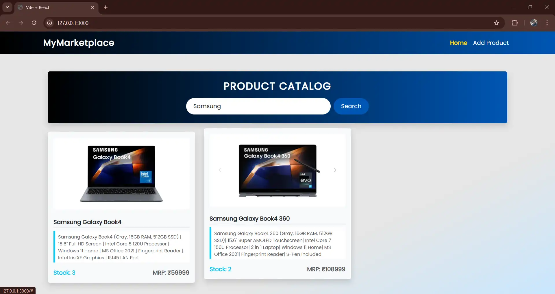
The ProductCatalog serves as the main page of our React application, providing a interface for users to browse and search products. It integrates several key features and components to create a functional page.
- State Management: It utilizes
useStateto manage key states of the component, including the product list (products), user search input (searchQuery), and a loading indicator (loading) for data fetching status. - Lifecycle Management: It also use
useEffectto automatically fetch the initial list of products from the API when the component is mounted for the first time. This helps us to load the data immediately once we open the page. - API Integration: We using the API functions (
fetchProductsandsearchProducts) which we defined earlier to handle backend requests for fetching all products or query them based on user input. - Components: We’ll use previously created the
SearchBarcomponent to search products and theProductListcomponent to display a list of products. Here, we integrate both components to create a smooth interface for browsing and filtering product data.
The ProductCatalog component ties these features together to deliver a clean and modular interface for managing product browsing and search functionalities. Its design ensures maintainability, scalability, and seamless integration with other parts of the application.
import { useState, useEffect } from 'react';
import ProductList from '../components/ProductList';
import SearchBar from '../components/SearchBar';
import { fetchProducts, searchProducts } from '../api/api';

const ProductCatalog = () => {
    const [products, setProducts] = useState([]);
    const [searchQuery, setSearchQuery] = useState('');
    const [loading, setLoading] = useState(false);

    useEffect(() => {
        fetchProductsList().then(() => {});
    }, []);

    const fetchProductsList = async () => {
        setLoading(true);
        try {
            const data = await fetchProducts();
            console.log(data); // Log here instead of chaining in useEffect
            setProducts(data);
        } catch (error) {
            console.error("Error fetching products:", error);
        } finally {
            setLoading(false);
        }
    };

    const handleSearch = async () => {
        setLoading(true);
        try {
            const data = await searchProducts(searchQuery);
            setProducts(data);
        } catch (error) {
            console.error("Error searching products:", error);
        } finally {
            setLoading(false);
        }
    };

    return (
        <div className="container mt-4">
            <header
                className="text-center mb-4 p-4 rounded shadow"
                style={{
                    background: "linear-gradient(to right, #000000, #0056b3)",
                    color: "#fff",
                    borderRadius: "12px",
                }}
            >
                <div>
                    <h1
                        className="h3 fw-bold mb-3"
                        style={{
                            textTransform: "uppercase",
                            letterSpacing: "2px",
                        }}
                    >
                        Product Catalog
                    </h1>
                    <SearchBar
                        searchQuery={searchQuery}
                        setSearchQuery={setSearchQuery}
                        handleSearch={handleSearch}
                    />
                </div>
            </header>
            {loading ? (
                <p className="text-center">Loading...</p>
            ) : (
                <ProductList products={products} />
            )}
        </div>
    );
};

export default ProductCatalog;
Product Upload Page
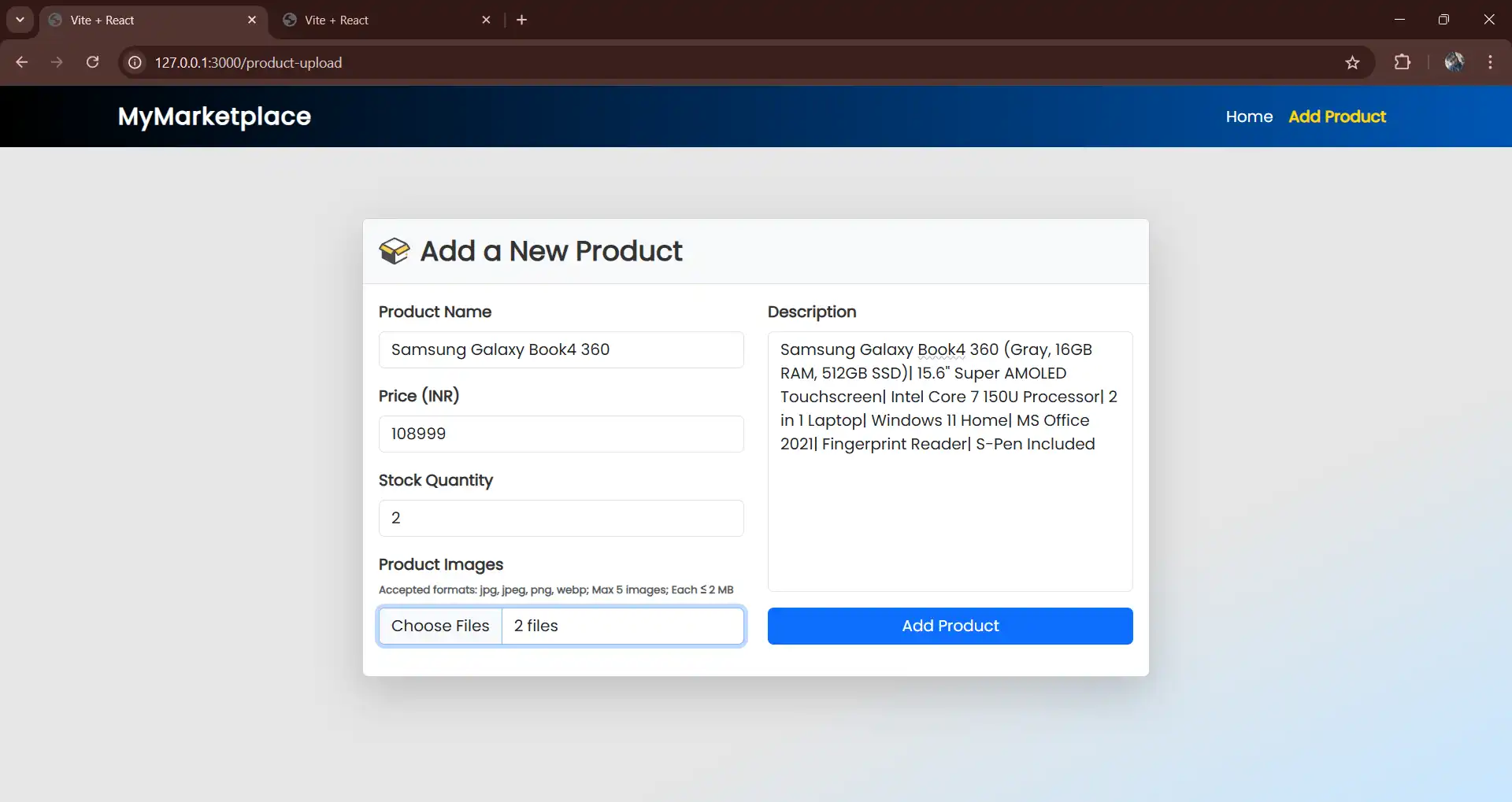
The ProductUpload page handles the functionality for adding new products to the application. It allows users to input product details, upload images, and submit the data to the backend API.
- State Management: It also use,
useStateto manage the list of uploaded files (files) and track error messages (errorMessage) for file validation and user feedback. - Form Handling: We’ll use
react-hook-formto manage the form’s input fields, submission, and validation. It usesregisterfor binding inputs,handleSubmitfor submission, andformState.errorsfor error tracking. - File Handling: Implements a
handleFileChangefunction to validate uploaded files based on type (jpg,jpeg,png,webp) and size (max 2 MB). The component stores accepted files in state and triggers an error message for invalid files. - API Integration: Sends product data and uploaded files to the backend as a
FormDataobject using thefetchAPI. The data includes JSON-formatted product details and image files. - Input Validation: Also, we’ll ensure that fields like product name, price, stock quantity, and description meet the required criteria and using
sanitizeInputfunction we’ll enforces to get only numeric input for fields like price and stock quantity.
import { useState } from "react";
import { useForm } from "react-hook-form";
import "bootstrap/dist/css/bootstrap.min.css";

const ProductUpload = () => {
    const { register, handleSubmit, formState: { errors } } = useForm();
    const [files, setFiles] = useState([]);
    const [errorMessage, setErrorMessage] = useState("");

    const onSubmit = async (data) => {
        const formData = new FormData();

        // Append product data as a JSON blob
        formData.append(
            "product",
            new Blob([JSON.stringify(data)], { type: "application/json" })
        );

        // Append selected files
        files.forEach((file) => {
            formData.append("productImages", file);
        });

        try {
            const response = await fetch("/api/products", {
                method: "POST",
                body: formData,
            });

            if (response.ok) {
                alert("Product added successfully!");
            } else {
                alert("Failed to add product.");
            }
        } catch (error) {
            console.error("Error:", error);
            alert("Something went wrong.");
        }
    };

    const handleFileChange = (e) => {
        const allowedTypes = ["image/jpeg", "image/png", "image/webp"];
        const maxFileSize = 2 * 1024 * 1024; // 2 MB in bytes
        const selectedFiles = Array.from(e.target.files);

        const filteredFiles = selectedFiles.filter(
            (file) => allowedTypes.includes(file.type) && file.size <= maxFileSize
        );

        setFiles(filteredFiles);

        let errorMsg = "";
        if (filteredFiles.length !== selectedFiles.length) {
            errorMsg = "Some files were rejected. Only jpg/jpeg, png, and webp are allowed, and each file must be ≤ 2MB OR 2048 KB.";
        }
        setErrorMessage(errorMsg);
    };


    const sanitizeInput = (e) => {
        e.target.value = e.target.value.replace(/[^0-9]/g, "");
    };

    return (
        <>
            <div className="container py-5 d-flex justify-content-center">
                <div className="card shadow-lg" style={{ maxWidth: "800px", width: "100%" }}>
                    <div
                        className="card-header d-flex align-items-center justify-content-between p-3"
                        style={{
                            backgroundColor: "#f8f9fa",
                            borderBottom: "1px solid #ddd",
                        }}
                    >
                        <div className="d-flex align-items-center">
                            <img
                                src="/package.svg"
                                alt="Package Icon"
                                style={{
                                    width: "32px",
                                    height: "32px",
                                    marginRight: "10px",
                                }}
                            />
                            <h3
                                className="mb-0 fw-bold"
                                style={{
                                    color: "#333",
                                }}
                            >
                                Add a New Product
                            </h3>
                        </div>
                    </div>
                    <div className="card-body">
                        <form onSubmit={handleSubmit(onSubmit)}>
                            <div className="row">
                                <div className="col-md-6">
                                    <div className="mb-3">
                                        <label className="form-label fw-bold" style={{ color: "#333" }}>
                                            Product Name
                                        </label>
                                        <input
                                            type="text"
                                            className={`form-control ${errors.name ? "is-invalid" : ""}`}
                                            placeholder="Enter product name"
                                            {...register("name", { required: true })}
                                        />
                                    </div>
                                    <div className="mb-3">
                                        <label className="form-label fw-bold" style={{ color: "#333" }}>
                                            Price (INR)
                                        </label>
                                        <input
                                            type="text"
                                            className={`form-control ${errors.price ? "is-invalid" : ""}`}
                                            placeholder="Enter price"
                                            onInput={sanitizeInput}
                                            {...register("price", { required: true, min: 0 })}
                                        />
                                    </div>
                                    <div className="mb-3">
                                        <label className="form-label fw-bold" style={{ color: "#333" }}>
                                            Stock Quantity
                                        </label>
                                        <input
                                            type="text"
                                            className={`form-control ${errors.stockQuantity ? "is-invalid" : ""}`}
                                            placeholder="Available stock"
                                            onInput={sanitizeInput}
                                            {...register("stockQuantity", { required: true, min: 0 })}
                                        />
                                    </div>
                                    <div className="mb-3">
                                        <label className="form-label fw-bold" style={{color: "#333"}}>
                                            Product Images <br/>
                                            <span className="text-muted"
                                                  style={{
                                                      fontSize: "0.675rem",
                                                  }}
                                            >Accepted formats: jpg, jpeg, png, webp; Max 5 images; Each ≤ 2 MB</span>
                                        </label>
                                        <input
                                            type="file"
                                            className="form-control"
                                            accept=".jpeg,.jpg,.png,.webp"
                                            multiple
                                            onChange={handleFileChange}
                                        />
                                        {errorMessage && (
                                            <div className="text-danger mt-2" style={{fontSize: "0.775rem"}}>
                                                {errorMessage}
                                            </div>
                                        )}
                                    </div>
                                </div>
                                <div className="col-md-6">
                                    <div className="mb-3">
                                        <label className="form-label fw-bold" style={{ color: "#333" }}>
                                            Description
                                        </label>
                                        <textarea
                                            className={`form-control ${errors.description ? "is-invalid" : ""}`}
                                            placeholder="Briefly describe the product"
                                            style={{ height: "265px", resize: "none", overflow: "auto" }}
                                            {...register("description", { required: true })}
                                        ></textarea>
                                    </div>
                                    <div className="text-center mt-3">
                                        <button
                                            type="submit"
                                            className="btn btn-primary btn-md"
                                            style={{ width: "100%" }}
                                            disabled={files.length > 5}
                                        >
                                            Add Product
                                        </button>
                                    </div>
                                </div>
                            </div>
                        </form>
                    </div>
                </div>
            </div>
        </>
    );
};

export default ProductUpload;
Configuring Vite for React and API Proxy
TNow, we have to configure the vite configuration file. This vite.config.js file sets up the React development environment. It includes the react plugin to support React features and configures the server to run on 0.0.0.0:3000. To connect the frontend with the backend, it uses a proxy that forwards /api requests to our Spring Boot Product API, which is running on http://127.0.0.1:8080. This proxy is essential for avoiding CORS issues, allowing the React frontend and the Spring Boot backend to communicate seamlessly during development.
import { defineConfig } from "vite";
import react from "@vitejs/plugin-react";

export default defineConfig({
  plugins: [react()],
  server: {
    host: "0.0.0.0",
    port: 3000,
    proxy: {
      "/api": {
        target: "http://127.0.0.1:8080",
        changeOrigin: true,
        secure: false,
      },
    },
  },
});
Starting the Application
Now, start by running your Spring Boot Product API on localhost:8080 to serve the backend functionality. Next, navigate to your React project directory and start the React application on localhost:3000. This setup ensures the frontend communicates with the backend through the configured proxy for a seamless development experience without any hassle.
Product Searching Page –
Product Uploading Page –
Creating a RESTful API with Spring Boot and integrating it with React as the front end might seem challenging at first.
This post has walked you through the process step by step, helping you understand the core concepts and implementation details. Now, you’re ready to build Rest APIs for your web applications.
Leave a Reply